So, for this
brief we were asked, to put together a scene including a character, throne and
backdrop related to theme ‘King of The Dead’ We were in teams of 5 and given weeks to complete the project.
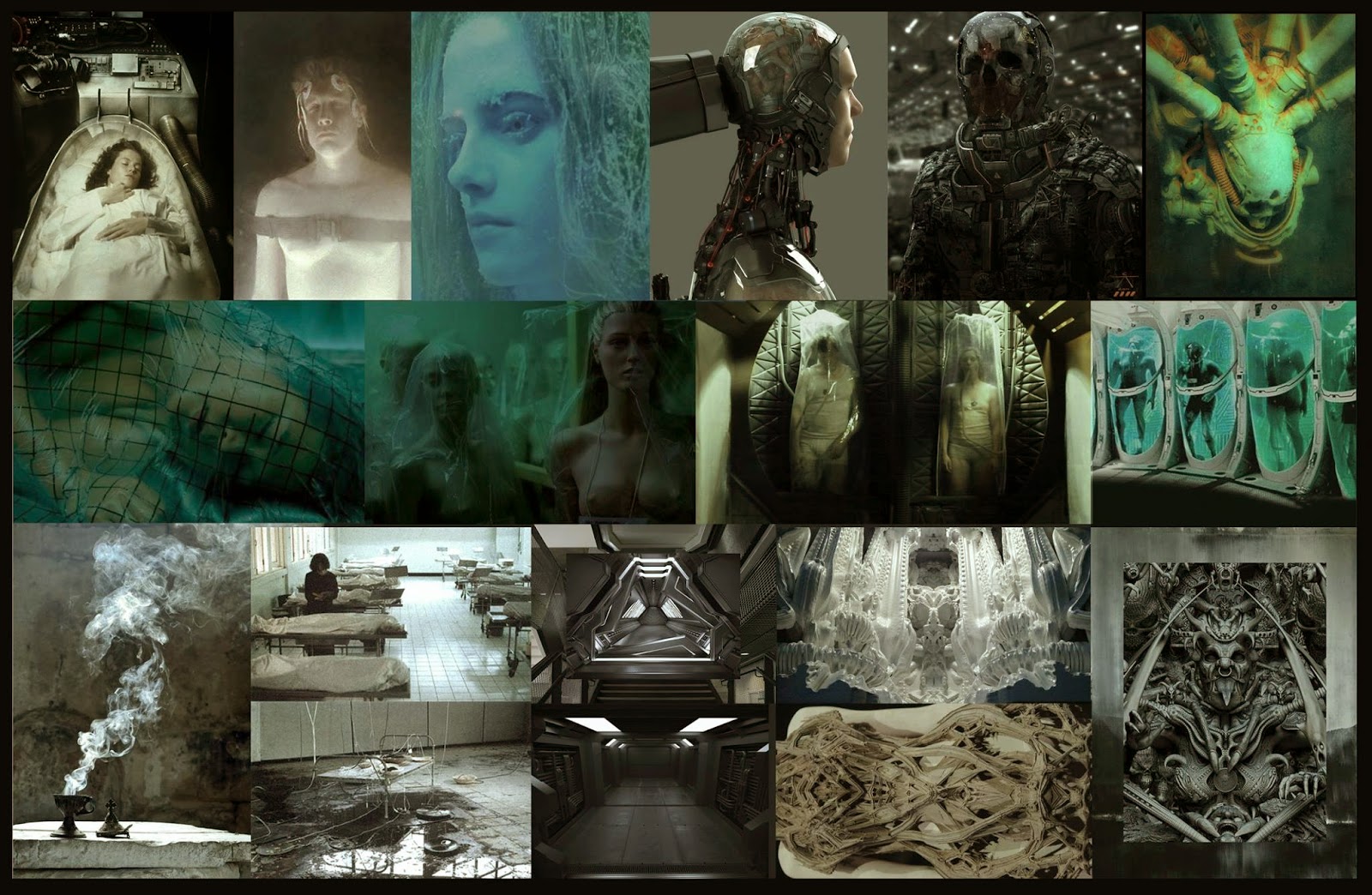
To start we brainstormed ideas and put together a Pinterest board full of images. We came to the conclusion that we wanted to be original and steer clear of the typical perceptions of death. We originally began to look at very dark, earthy ideas, full of dirt and grunge. After asking round and getting second opinions, it was suggested to us that we explore the complete opposite and have a very clinical, clean, almost sci-fi feel.
To start we brainstormed ideas and put together a Pinterest board full of images. We came to the conclusion that we wanted to be original and steer clear of the typical perceptions of death. We originally began to look at very dark, earthy ideas, full of dirt and grunge. After asking round and getting second opinions, it was suggested to us that we explore the complete opposite and have a very clinical, clean, almost sci-fi feel.
We looked into the idea of a cult and possibly give the
scene some back story, as to how it came to be. We thought of a futuristic
world, where people are living longer due to highly sophisticated medicine
giving people an infinite life-span. We liked the idea to base our scene around
a cult that resides in this world. Worshiping the dead as people are put
through long empty lives. They choose to join the cult and worship a
cryogenically frozen being, to whom they give offerings to, in the hopes of him
granting death upon them. Below are some of my concepts that explore this idea.
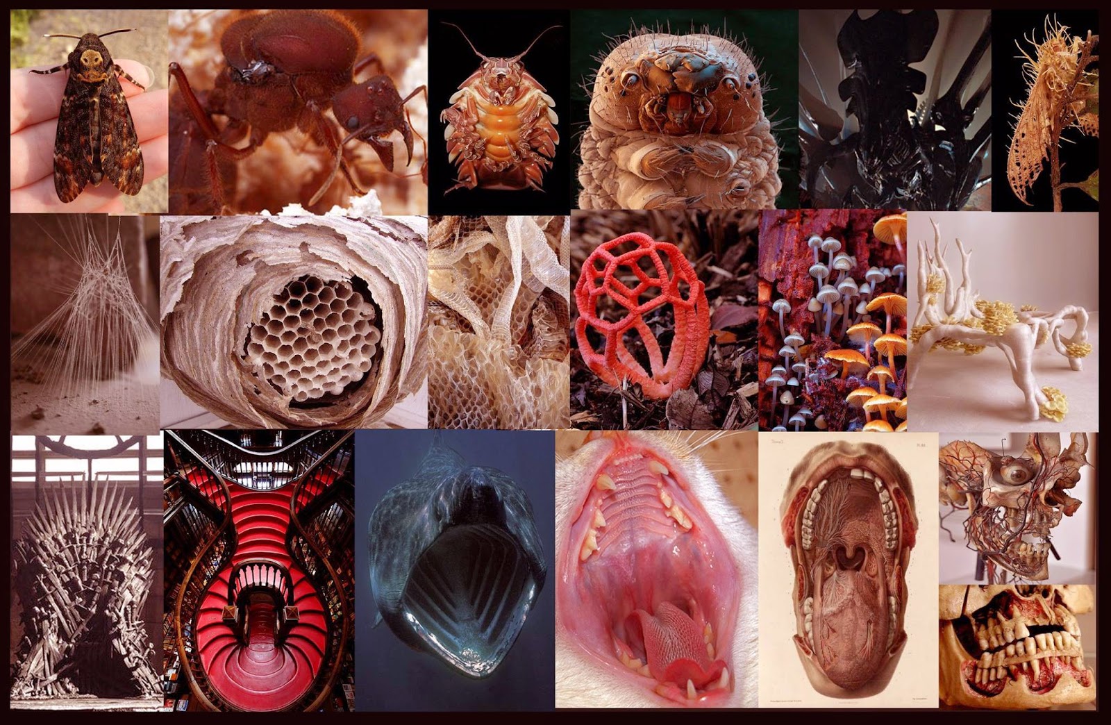
As well as this idea. We also explored one of our
brainstormed ideas of parasites. The idea of a being that feasts off of other
beings, taking all of their life source, essentially killing so it could live.
As well as residing thing the host. Below is some more work exploring this
idea by Katie.
As the project
continued we gathered reference from many areas. We all decided we liked the
idea of an ancient culture mixed in with the sci-fi theme. We began to look at
a lot of Egyptian and Mayan imagery. This helped us shape our own designs for
the culture we wanted to portray in our scene.
We split the team up into, 2 people working on the character, 2 people working on the throne and the remaining person working on the backdrop. I was given the task of designing the characters head. Below are some of the initial concepts I came up with.
The overall shape of the thrown was decided early on. Below is the original
design by Rebecca. It replicates the idea of a mouth and this related back to
our parasite concept. With this we decided to combine the 2 ideas, making an
ancient sci-fi looking scene, whereby the ‘king’ sits in the frozen chamber
which resides in a mouth shaped tomb/throne. Also here are some of the modelled
ideas by Tom.
The first few passes of the throne helped us understand what
materials we needed to use. I was given the task of designing the character
with the help of another team member. The character by far went through the
most iteration out of all the assets in the scene. We went through many ideas
and looked at how the characters presence in the scene could be portrayed. Below
are some poses that katie came up with.
After gathering more reference and discussing ideas within
the group, we decided to try taking our character appear more mutant like.
Below are some explorations of this theme and the reference I gathered.
This allowed me to explore more with the face of the character, here are some examples.
Comparing these with the costume design, they both helped fuel and form ideas
for each other. We continued to work on each other’s work and eventually we
started to form a look of which we all liked the look of. It helped influence
the rest of the scene, and I feel the style ties the objects together well.
Below is the images in order as they were being produced by both me and Katie.
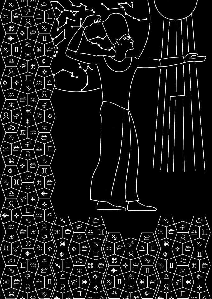
Alongside this, a motif for the backdrop was being designed. Hal took a lot of inspiration for the Egyptian hieroglyphics. He tried to put our own sci-fi unique cultural twist onto the design with the symbolism. Below are some of his designs.
We were also exploring colour and whether a strongly
saturated colour would work well within the scene. Below are some variations.
We eventually decided a more neutral colour would work best, as it was hard to
situate a stronger colour to match the desired mood and feel we were looking
for.
My personal experience of this project was an interesting
one. From looking at our final outcome, I feel that we lost sight of what w originally
set out to create. I feel possibly, by combining the 2 ideas, it made the whole
project and idea generation very bland. I feel we were trying to tick too many
boxes with our final.
I feel that our original very sci-fi idea would have come off much stronger and
had a much clearer back story to the scene. It also would have made for some
interesting designs and created great opportunities for high quality engine
work. The final render of the scene however, is something I am happy with. It’s
interesting, unique and shows innovative design, strongly showcasing our take
on the reference we used for inspiration. I just feel it could’ve been stronger
if we had elaborated more on the sci-fi cult idea. I think with more
communication amongst the team, and stronger crit we may have sculpted our idea
to be more refined.
The team worked well together and I felt we had a strong
work ethic amongst ourselves. We did communicate well but more of this I think
would’ve really benefitted the final scene. I enjoyed the experience of working
as a team, and I feel it has made me more aware of my own work ethic. I learnt
to show work for crit more and to try and produce work fast in order to show as
many ideas as possible. This will help me to fit into a team more and make more
of a contribution to help form ideas.


No comments:
Post a Comment