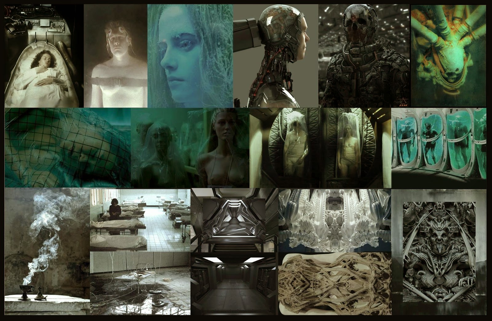
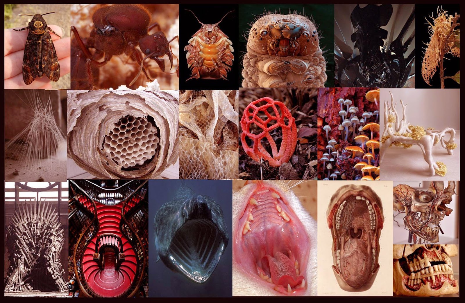
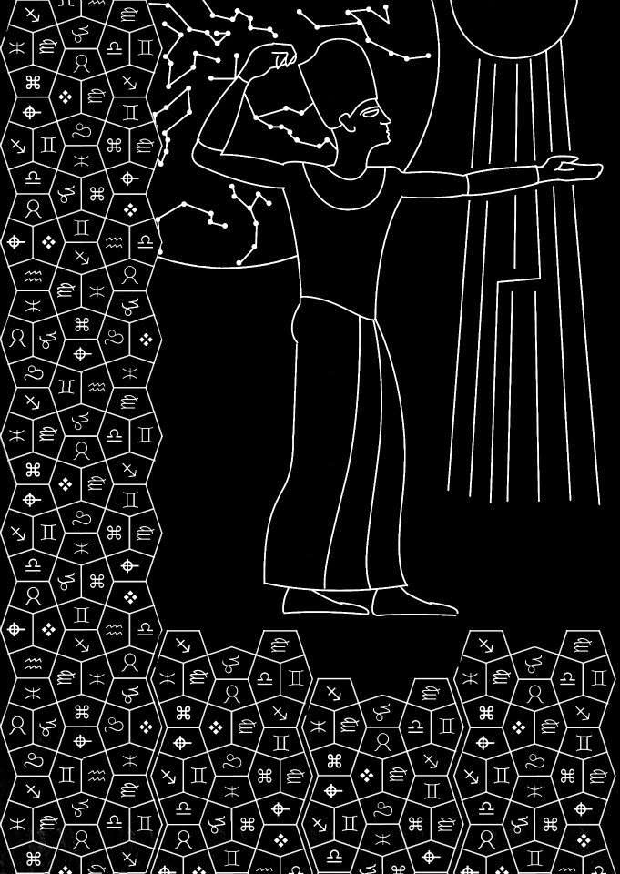
Well my god, this
project is epic! We have been given the task, as a year group, to design and
make a 3D side scroller game. It will consist of 4 levels, 2 main characters
and 4 NPC characters. We’ve been given the theme of fantasy, and each level has
a buzzword to help shape the design of each level. We were given this layout to
work from and set up into teams.
There is a team of 4 for each level which includes 3 environment artists and 1 concept artist. Then there is a team of 5 character artists, and finally there is the engine team consisting of 2 members. This project will require concrete communication between groups and all taking part in this project.
I was part of the team working on the first level, which was given the buzzword hot. I was given the role of concept artist for the team and was very excited about this job role. I want to go into concept art for my career, so this was a good opportunity to live out this role and see how I would fair in a group, almost industry like environment and setting. In the beginning, the whole team had a hand at what is considered the concept artists role. We all had to produce design and concept work to help form ideas. As time went on and the momentum picked up, 3D modelling could be done. From here, my role was to produce design work for assets, paint overs of the whitebox screenshots and general concept work for the level.
As a team, I felt we all worked well together and were not shy to crit and open
up about ideas. We all understood our job roles but were also willing to help
out with each other’s work if needed. We had a lot of ideas and brainstormed
things that related to hot. We also used side scroller games we knew of as
reference to help work out what our level should actually be. We had a range of
ideas, some fairly specific to games we knew of and some more general in terms
of the fantasy theme. A theme we thought of was a hot kitchen and have a game
very much like micro machines, a tiny character in oversized surroundings.
However we needed to keep in with what the other teams were doing; as we all
decided that we wanted the game to flow and that each level should look part of
the same world. The main inspiration for our level was the trine series. We
wanted to produce something fairly similar, but toning down the saturation of
the colours. Once we had ideas in place, we worked well and at a reasonable
place to keep momentum going. We were also constantly changing ideas which kept
the project fresh and interesting to us. We all had great enthusiasm for one
another’s ideas and every person’s input is shown in the final result.
There were a few complications and the layout changed several times.
First of all we did struggle to work out how the level layout would look originally.
This meant a lot of research into existing side scroller games that have solved
these problems before. Looking at puzzles, what could be used for platforms,
traps etc. Doing all this but making fun and interesting with the limitations
we had, in terms of whether the engine team could pull off all the events we
were wanting. Below is a couple of early ideas we had for our level layout. We
felt after time and after discussing our layout with others, it felt almost
empty and that the level lacked structure. I came up with the idea of basing
the platforms around a large tree, situated in the centre of the vertical
section of our level.
This later turned into another issue. We ended up basing our level on
the upright L shape, when actually our level was a laying down L shape. This
meant a slight reshuffle of how the platforms would work in the level,
especially in the beginning section. This, however, turned out a lot better and
actually helped the final design of our level.
Another problem we encountered was, again, the beginning sections of the level; In which the player travels down the tree. We originally intended to have the player travel down the outside of the tree, down branches, vines and bridges. One of the engine artists pointed out that there was nothing to stop the player from running off the end of the branches. So to fix this problem, we decided to make it so the player travelled down the inside of the tree. This made for a more linear approach to this section of the level, which I feel didn’t hinder the fun in the level.
Another problem we encountered was, again, the beginning sections of the level; In which the player travels down the tree. We originally intended to have the player travel down the outside of the tree, down branches, vines and bridges. One of the engine artists pointed out that there was nothing to stop the player from running off the end of the branches. So to fix this problem, we decided to make it so the player travelled down the inside of the tree. This made for a more linear approach to this section of the level, which I feel didn’t hinder the fun in the level.
A large problem with the project was that we had
little time to make this project from scratch. This issue was discussed with
the tutors in charge who were playing the role of art director. As we are Game
Art designers rather than game designers, we ended up taking on many more job
roles then what were originally intended for us. I think we did well despite
this. We were organised, held regular meetings to keep track of everybody’s
progress and had shared folders which we could all access in order to share
assets, to speed up production time. More of this is always a good way to
improve and I think that’s what we could’ve done. Also, we could have possibly
put together a timescale to show what needed to be done by when. This may have
helped with leaving us more time to polish the levels.
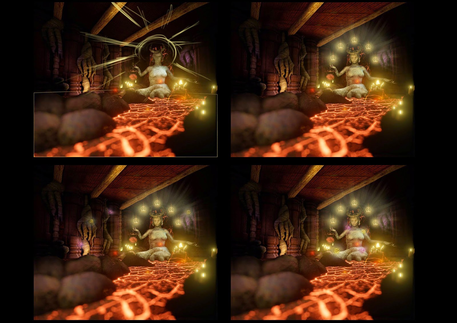
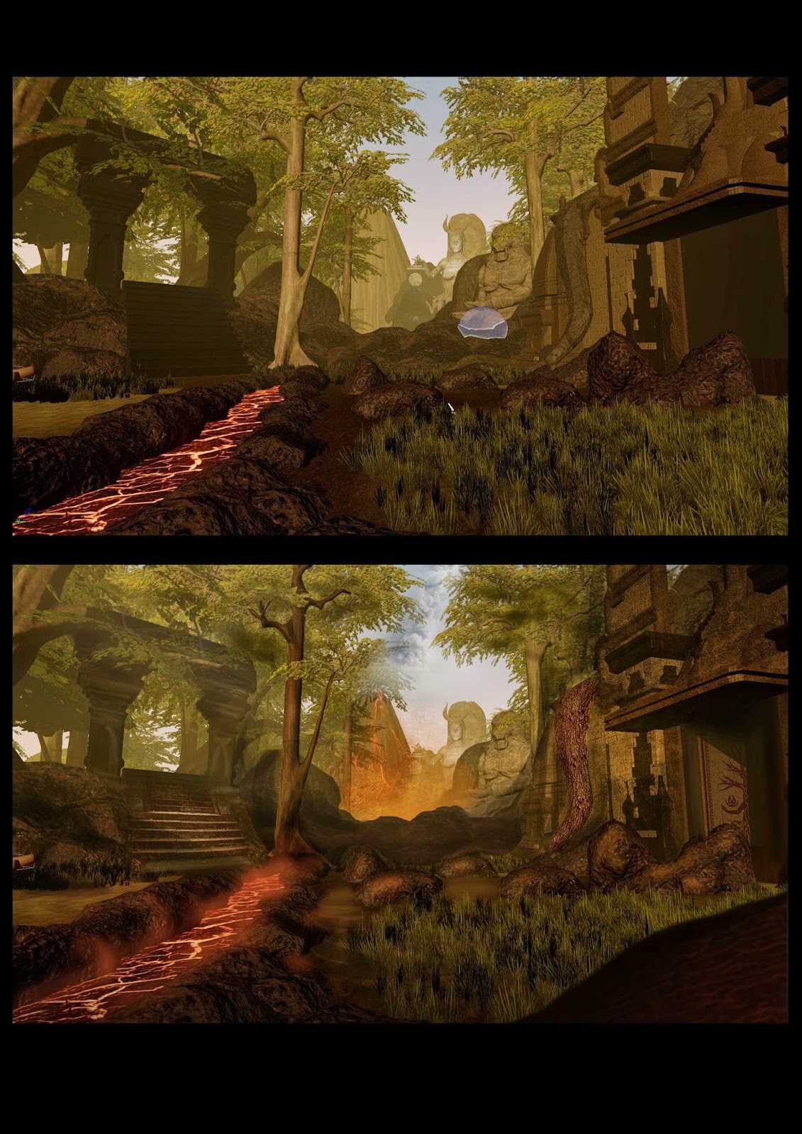
In conclusion this project was a good experience of working on team effort with a large group. I felt it really did emulate an industry setting, working collectively on a single project. To also be working the job role I intend to pursue, was eye opening and I really enjoyed being able to fully embody this role. I think our final game turned out really well despite the rocky patches and feeling lost for reasons out of our control. I can’t help but feel with more organisation by the tutors, the project would’ve run much more smoothly and this wouldn’t have disheartening all of us at that certain point. With more time (as always) we could’ve put more effort into the after affects and possibly added more threats such as enemies that require animations. For what it is, I think the level answers the project brief, it’s a fantasy side scroller that’s family friendly. It has a story and flows between levels with a consistent high quality style. I feel we worked really well as a team and I am greater for the experience.
https://www.youtube.com/watch?v=25bQnu5LoH0&list=FLqEoY0yw_IvFsfjLQhusMeA&index=1


