Sunday 1 December 2013

Elements of Game Design: Part 7 – Level Design

Level design is a much more intricate aspect of game design then first thought. It’s creating a world, and essentially playing god. Particulaly when designing natural environments. These must have flow, that of which would be believable and something people could relate to in nature and the world around them. But also enhance the experience for the player.

Level design can easily get caught up in being about visuals, how the world and environments look. However it is much more then that. Granted a designer must create an atmosphere or a mood to add to the eventual gaming experience. But building the structure and machanics of a level is a much more technical trait, one that will eventually have to intergrate with visuals and composition.

Some companies allow untextured levels to be played in order to test and explore the work so far. This helps remove all distractions that comes with textures and effects in order to only judge and critique the flow of the level design as a structure. A level should also be accustomed to the desired gameplay, for instance, explorative games need to be quite broad and not too confined, whereas a first person shooter game, would benefiit from corners, internal and intricate structures to add to gameplay.
This blog post discuss’ and explores the level design of the game Portal. A very heavily puzzle based level design, that engages the player to use their full capability in order to work out how to progress in the game.


From past to present, level design has always been the main focus of games and over time has developed into a much more spectacular aspect of a game. In the early days of such games like Mario, simple side scroller level design was used.  As simple as it looks, a lot of clever and carefully thought out choices were made in order to create increasing levels of difficulty within the game flow as the player progressed. Same as for Sonic the Hedgehog. This however always seems quite manic to me, in the later levels I found myself going backwards and getting lost, confused as to where I had to go next.


But obviously looking at games such as The Last of Us (again, I’m sorry but I damn well love this game!!) Shadow of the Colossus, Assassins Creed, Dark Sous etc. Level design has become a lot broader but still all the more intricate. There are bigger worlds to be explored allowing for broader gameplay. In games such as Skyrim and World of Warcraft, there is so much vast and barren landscape, that wouldn’t require a lot of intricacy, but still need to be controlled. However, the textures and effects created in the game engine, would be what would sell the level design and indeed, the game itself. This is why further understanding of utilising 3D space is so crucial in modern game. So much knowledge and understanding of game mechanics is required in order to make a successful level. Fundamentals are key before dressing up a level with textures can even be considered; functionality of the world comes first and is the responsibility of a level designer.

Sunday 17 November 2013

Elements of game design, part 6: Visual composition

To work on visual composition is to plan what eventually will become 3rd dimension and even 4th. In order to nail the feel and style of an environment, character etc. There needs to be a full understanding of the fundamentals that can be learned from the great classical artists. Things like understanding 3D form and lighting, using these to create a feel, a mood, to visually communicate your ideas. These are all required when creating these fundamental attributes in game design.


These images are works from the game The Last of Us. As you can tell I am quite a big fan of this game. I feel it symbolises everything that I feel makes a great, engaging game. Every detail is perfect in my opinion. For example all of these landscape concepts depict the mood and feel for that  particular environment. The fundamentals are down. Use of perspective to enhance the 3D readability of the image. As well as clever lighting and layout, every single one of these images is immersive. They all stick to a very organic colour pallet with muted colours that tied in with all the other technical choices made for the imagery. Having seen and experienced the final outcome, they really stayed true to the images and style that they created in the early stages of  of design.   


This stretches through to the character development, including the monsters and enemies in the game. They followed the same believable and realistically possible structure that the environments had. Countless variations and different ideas are put into characters. Once a final design is decided, an illustration of the characters needs to be done in order to show their personality. Again they need to be readable just from just one image as well as a series of images.

To place the characters within an environment composition also shows how characters and environments tie together, to show an all-round immersive feel to the imagery. It gives us a chance to understand the human impact within the surroundings that have been created.
I feel that simplicity is key when coming up with the visual compositions. Over complicating an image can cloud the original message within the scene, and how people read it and interpret it. Using the great classical elements that made the great masters artworks, can enhance the impact of games concepts and design on the viewer. It is becoming an art form within itself. The games industry is becoming a lot more art conscious and is hiring and requiring more and more technically exceptional artists to produce their design and concepts work.


I stumbled across this article written by the film critic Roger Elbert, entitled ‘Video Games Can Never Be Art’ http://www.rogerebert.com/rogers-journal/video-games-can-never-be-art This article was written on April 16th, 2010. Robert Elbert passed away on the 4th of April 2013 at the age of 70. He stated that Video games would never be art in the lifetime of anyone who has a current interest in them. But this is coming from a man of 67 who has seen a lot of new technological advances, but believes in the stigma that games cannot be art. I feel that The Last Of Us challenges his words. I feel it matches with other forms of art of storytelling but in such an advanced way. 

If people could see games for what they are now and are fast becoming, without the stigma they’ve seemed to have gained over the years, I’m sure many would question their own opinions. So many art forms are taken into consideration with modern games, from visual style to the music used. I feel they are on a fast track to becoming a controversial art form, that I personally love and these are elements that I always look for within a game.

Elements of game design part 5: Planning and Concepting

The making a game and many things in this word is a series of planned out processes that follow a strict formula. 

This work flow is the basis for design. It’s a series of trial and error. Idea generation, starting with no boundaries to help loosen up the mind to be inventive and creative when coming up with new ideas. Through this process of handing in ideas, and receiving opinion, constraints are born. This helps to really focus the team on what direction all idea’s should be following.

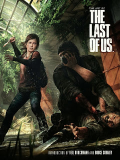
Looking through a recent purchase of mine ‘The Last Of Us’ art book (pictured below) In the introduction it states, they were told to “develop Naughty Dog’s next big franchise.” From this broad scope they had to narrow down every element of the game. The first idea/restriction they came up with, was to base the story around the relationship between 2 characters, this then quickly developed into the idea of a father daughter type relationship.


This was a solid ground to work on, as obviously, the game ended up exactly as such. A good base idea can carry out all planning and development for the entire concepting process. In constrains we begin to find what exactly is needed to make this game a success. Multiples of people are always involved. With most of the time the creators and idea generators have to answer to those who are funding the project and producers. These back and fourths between people again, are key to moulding an idea to eventually reach its final desired outcome. 

For me personally I find once I have an idea planted in my head, I try my best to stick to that idea. To the point where I will discard any other good idea just because my first idea was such a great idea that helped spur the rest of my designs.

For instants. A current project I’m working on, is to design a land sea and air vehicle that can carry 2 people and a lot of equipment. As soon as I heard the project brief, I instantly thought of a vehicle I saw on the TV show Top Gear. 


This car had tyres with built in paddles that scoop the water and placed in such a way on the tires, that when it hits the water it skims across it. I had this idea of the tyres stuck in my head right from the word go. However when designing, you have to generate a load of concepts to explore as many idea’s as possible. In this process, I tried out some ideas that use the same systems as a hovercraft.


This was my main idea, (pictured above) where by the cylinders at the side would act as the paddled tyres as well as the protective case for the propeller’s. I had my heart set on this idea, but this idea (pictures below) has also wormed its way into my favourites.  


It’s a concise and simple idea, which is why I think its works so well. I have yet to develop the original idea. So I have yet to see its full potential.

The process of concepting is purely about idea generation and not getting too attached to an idea. You need to be able to churn idea after idea out into the firing line. A lot of idea will be rejected even ones that you particularly love. The game design process is a team effort, and there will always be others that will object to your ideas, but also be willing to collaborate on them further. 

Reflection on year 1, and ambition for year 2

So I’m back fresh and slightly terrified after a long yet very quick summer break. On receiving my results I suddenly realised just how much this course asks of me. I felt I worked myself the hardest throughout my entire educational journey for this course and yet I scraped by with a minuscule pass mark…oh dear.

This truly scared into thinking I seriously need to up my game. Even though I felt it was the hardest I’ve ever worked (and it was) I can still see where I needed to pick up the slack. Better planning and consistency are key I think. I made a habit of not starting things right away, as well as spending more time and effort on some projects rather than others. Balancing time is so crucial on this course and I need to be incredibly strict just too even begin to pull it off.

I’m not really majorly happy with any of the work I did in the first year, which is something that needs to change for the second year. This is when we start to think about portfolio and employment, which in itself, seems incredibly daunting. I feel I will never be prepared enough for work in this industry. I guess that’s what the second year is for. I just hope it works out that way.

So it’s all up to me. Only I can make whatever I want from this course. Starting with better organisation. I find that I spend more time on 3D work, simply because it is my weakest suit. I panic and stress to the point where I’ve completed a task that still looks shockingly bad, but also has left me no time for any other work. Clever I know. So, I guess I need to spread my time and effort more effectively. Possibly find time to practice my own skills, the things I enjoy the most, like tradition 2d as well as digital painting.

I need to re-realise why I chose this course in the first place. I got caught up in the work load and completely forgot why I signed up in the first place. I aim to be a concept artist, to be even more specific, a character concept artist. That was my main inspiration all along. Those characters I drew throughout my school years because school was just so painfully dull and I wish I focused on that more. I hope that with focus on employment this year, as well as an opportunity to do some awesome work for portfolio. I think a big thing to keep in mind is stress. I refuse to stress this year, as I have a personal situation that comes with all the downs I can handle.

My boyfriend is a soldier and is on tour to Afghanistan. I had to deal with this last year too but only for the first month or so. This time round, he’ll be away for my whole second year. This sucks because he always puts so much faith in me and tells me that I can do anything I set my mind to. If anything, I want to do well in this course for him, to prove that he was right all along.

Thursday 23 May 2013

My Personal Review of the First Year


So it’s over, my first year gone in what feels like a flash of stress, long working hours and panic. But it wasn't all that bad, I feel as a whole I've dealt with this whole new experience well.
The curriculum was set at a very fast rate, this was a shock to the system to say the least. Especially finding my way around 3dsMax, which seemed to be an abyss of technical jargon and an endless list of problems and hurdles to overcome. 

In the early days, I felt completely lost in the 3d side of the course. I am in no way a technical buff,
nor I think I ever quite will be. I felt like nobody wanted to teach me and if
they did I would be a burden to them, so I guess I suffered in silence. Which I
learnt wasn't the right thing to do. So I began to speak up and ask questions 
and listen to advice, I watched tutorials and quickly realised that I would have 
to learn the majority of this stuff myself. Which made me feel cheated out of 
an education. I knuckled down whilst all the while I felt my visual design work 
was being pushed aside. I didn't want this to happen as the 2D work is the 
stuff I prefer, but I feel that my skills in this area, have begun to slide. 
Critical studies helped me understand, made me realise how the industry 
works and also how the degree wasn't going to be handed to me on a silver 
platter whilst I sit there. I was inspired during every lecture and my mind 
would open up to new things and to new ways of thinking. 


So I pushed on and worked hard, on 3D especially. I felt I did my best, even surpassed myself, but it turned out to be not quite enough. I failed 3D after my second formative assessment, it was by a mere 5 marks but it really shook me. I felt that no matter what I did it wouldn't be good enough. But I was reassured by many people, my peers, my friends and my loved ones that I just have to do my best but I needed to push further. I realised not being the best at 3D isn't the end of the world as this course offers so many opportunities in a wide range of industries.
I want a roll that allows for creative design, not so much the making. My technical skills require a lot of improvement, but I’m fairly confident my art and design skills can be improved with enthusiasm. I want my creativity to be my selling point. The demand for individuality in order to be noticed when it comes to employment in this industry, is growing higher and higher as each year passes. I want to make sure I can keep up and stand out. I plan to do this by building on my strengths in things I enjoy, as the main goal is to have a successful but above all enjoyable career.


Each project required responsibility for our own learning, even for the first year, a lot was expected of all of us. 3D in particular I felt completely alone which, was the bulk of my stress. I knew nothing of this technology and was left alone to deal with it. Now I feel I’m at a level where I can begin being creative and not be held back by a lack of technical knowledge. I enjoyed the amount of free reign we had on a lot of the Visual Design projects. I particularly enjoyed the character projects such as the reef character and the 70’s character. Also using UDK to create a level, I felt like this would be a good opportunity to be creative and begin to develop my industry standard of work but this again back fired due to my lack of technical knowledge on a new piece of software.


However, this has made me more than determined, I plan to spend my summer practicing my skills in particular 3D and painting using Photoshop, as well as rebuild my own hobbies and interests, because as the saying goes, all work and no play makes jack a dull boy.  


Tuesday 5 March 2013

Elements of Game Design, Part 4: Environment


As the years go by these become for more visually stunning and become more interactive and explorative than ever before. A level designer needs to give instruction to guarantee flowing gameplay, but not so much that it is obvious to the play. There still needs to be a challenge and a sense of discovery once you uncover the next task or stage of the game.
So many aspects of an environment can influence the atmosphere. The biggest being lighting and weather. How the light plays with object surfaces and textures can really highlight and intensify the desired atmosphere. Dark and gloomy lighting, with stormy weather can obviously create a very sinister feel, whereas a breaking dawn with a beautiful sunrise, casting an autumn coloured glow, would to create a feeling of hope and adventure, a new beginning. Scenery and surrounding also influence the aesthetics of a game environment. Built up cities, or open fields support many different ways of gameplay. Open fields and wide spacing, leave players to roam, giving a wide scope of exploration. A city environment could be controlled, cities are mapped out in real life to create flow, allowing people to reach certain destinations, this is true of video games also. Even though a huge city would leave room for exploration, but many games that use this type of layout are usually quite linear, you go in a certain direction to reach a certain goal.

Depending on the game style/genre, the levels of realism and stylisation have to be measured carefully. As well as other things, the environment of a game plays a key role in making a player believe the world they are in. With greater technology as the years progress, the level of realism to the visual graphics of a game has reached high levels, with recent releases, it becomes more and more difficult to determine what is real and what is game graphics. Such as the very recent release Tomb Rader, I personally was stunned by the graphics and the quality of realism that was obviously present. In terms of whether an environment is physically possible to recreate in our world, the level and practical realism is a rough area. For me, if It looks right and doesn’t bend any laws of physics, then it wouldn’t drag me out of my gameplay. But I love highly stylised visuals just as much as I love revolutionary, highly realistic looking graphics. The environments in games such as final fantasy 10 and Halo are visually stunning and encapsulating, and have just as bigger impact as realistic environments, but it is entirely dependent on the genre of the game.   


Personally one of the most amazingly breath-taking environment I’ve seen of recent belong to ‘That Game Company’ title Journey. Its style is highly simplistic but simple beautiful. The environments rage from huge desert, to an underwater world, to a winter wonderland. They are all environments, unlike any others. They were so well executed that you could feel the cold when battle through the snow storm, my throat felt dry when wondering through the dessert. Everything was so complimentary even though you went from sand to snow, hot to cold, everything still flowed. 


Environments in games give it identity and style. So much can be said through just how a building looks, or how an environments flows from one extreme to another. Without cleverly executed and though out environments, games would not have that power that they have on the human mind and allowing us to explore the form of escapism it gives us. 

Elements of Game Design, Part 3: Character


A set of interesting and well-designed character are what drive a game and its story. Characters help us, the viewer, form a bond with what’s happen around us, giving us a first person insight into the world we are driven to explore. They help us interact and be a part of the story. In books, TV and film this is also apparent. Seeing a characters emotion and reaction to situations, we are able to see for ourselves, we see into the characters mind and empathise with this person in front of us, bearing our soul. In games you do anything to stop your character from dying or being injured, there is an embedded fear of being attacked or anything bad happening to a character. It makes us cautious, we change how we are, our mood, our body language, anything and everything to do whatever it takes to make sure your character succeeds by any means necessary. It's this bond that immerses our emotions into a game, as the link below shows, all be it in very extreme ways:  


From personal experience of characters in games, I grew a close bond to a certain game. To say these characters felt like family is highly cliché, but there is no other way to describe it. I saw these character from a young age and they have always been in my memory. I’m talking about final fantasy 7………again, but this shows what I mean by how much this game means to me and how much it has impacted my outlook on life. 


To me every aspect of the game, makes it the perfect game, but a big part is the characters. Even though technology wasn't its best at the time, to the point where the characters couldn't even speak, but this didn't stop characters from developing personalities. Everybody is seen and ‘heard’ even though they don’t speak. This is where script comes in, and how it is more important that the script is right. With modern games, the script is still important but it’s the voice acting that makes the script shine. Back in the days of final fantasy 7, the player had to gauge a characters emotion from written words alone. Script in terms of punctuation was crucial. Sure it could make for lengthy conversation and cut scenes having to read what a character is saying, but it still managed to grip you and keep on hanging onto every last word. 


In a game like Metal Gear Solid 4, acting and body language played huge parts in the cut scenes. Again, as the above video shows, the cut scenes are lengthy in this game, and I did find myself fading in and out of conversation, but it was the acting and body language that distracted me. The emotion in characters faces and the pain in there body when they twist and contort, makes for a realistic, believable scenario. 

To me, a story that shows in depth character development and a heavy focus on an interestingly intricate story line, is key to a memorable experience. Whether it be film, TV, books or games, a story can be gripping when all the ingredients are well balanced and of good quality. Characters help us become part of the story. We look for qualities in the characters that we can also see in ourselves. This gives us connections, makes us feel a part of what we’re viewing and this is so true in computer games, more so than any other form of media.

Elements of Game Design, part 2: Art Direction for Games


Art direction in games is a crucial part of the development process for a game. The art direction tells us, and the people working on it how to make things look and feel. This makes or breaks how a player reacts and immerses themselves within a game. Without it a game would have little or no identity. The art director is responsible for pretty much everything a game has to offer visually. They are responsible for the overall look of a game, this relates to everything from textures to cracks in the walls, they decide how things should look in order to keep in line with the theme and tone that has been decided upon. http://my.safaribooksonline.com/159200430X/ch11lev1sec2?portal=oreilly

This role requires a highly creative mind and a visionary type of character. Someone who is always thinking ahead and constantly thinking of the work ahead of them. Ways to improve and to better the quality of work they have to produce as a team. To make an exceptional art director, you don’t only need creative flare; something that is just as important is a good team leader. As is stated in this link http://www.gamasutra.com/view/feature/3115/common_methodologies_for_lead_.php :

The best teams I've worked with had an art director and lead artist who worked closely together and respected each other's roles. They communicated openly. They agreed upon the visual direction of the product and discussed their respective responsibilities that were required to carry out the execution of the design. Not surprisingly, they were relatively stress-free teams. With the definitions out of the way, we can look at the methodologies and stages of production the lead may encounter.”

In order for a team to create a highly detailed, flowing game, that has all the qualities the art director is looking for, they need to have close communication with everyone on the team. Collaboration is another crucial part of art development, many ideas working well together is usually a highly successful technique if done properly. Collaboration cannot work without good communication and understanding of one another. A team leader (art director) needs to be able to collect ideas from different areas and work them together. This calls for decision making, every decision counts to the end result in some way and it’s up to the art director to make these tough decisions. 

Game art direction is one daunting role to be a part of, let alone be the leader of. In comparison to an art director in film, the roles are quite similar. According to the step by step guide on wiki how, http://www.wikihow.com/Become-an-Art-Director-in-Film an art director has to design a set, right down to the smallest detail. This is similar to an art director for a games company, designing an environment then deciding what to use and what not to use. However from reading the above webpage, it seems to be much more of a solo career in the films industry then in games. There seems to be little collaboration or signs of working with a team. Also, an art director has to choose the feel and mood, and set the vibe for the entire game through its visuals. This stretches beyond the environments, and right to characters and vehicles as well.


From this comparison, I understand just how much an art director has to take on when helping to create a game. As well as having to lead a team, it adds further social pressure compared to a more solitude design process that an art director for a film would have to endure. Game production has such a wide scope and needs a lot of peoples help. Communication in order to make the story flow from its different areas of creation, seems crucial to making an iconic game. 

Elements of Design, Part 1: From Pong to next Generation


As technology and people’s exposure to so much more of the world becomes more imminent, the next generation of games have to keep up and follow along with the rest of the media. With the arrival of next generation hardware, we were given highly realistic and believable surroundings. This undoubtedly sparked our imagination, but was there a specific reason for this? Games in terms of plot don’t hugely differ from own to another. There are goodies and badies, you against another, in order to succeed you must be the best at what ever task it is that is in your way. 


Gameplay allows us to do things we could not normally do. It is escapism, and all areas of a game must work together to make it successful. Industry wants to sell and starting with Pong, the selling point was it was new and technological for its time. Ping pong could now be played on screen and you had to beat your opponent in order to succeed. The look was minimal purely due to the available technology at this time. Comparing computer games with traditional board games is often done, but for what reason. Board games are constrained and rule bound, there is a certain way to play and a certain way to win. With game play or ‘play’, especially with modern hardware, there are so many different ways to play, the world is yours to explore and in your own way and on your own terms. 


Next generation games allow play instead of just taking part in a game. You are the main attraction in whatever world you desire to be a part of. Ranging from different types of playing style to the interactivity that different platforms have to offer. The task of designing is a team effort resulting in pages and pages of story idea’s, character, genre, environment style, play type etc.   http://www.gamasutra.com/view/feature/2156/game_design_theory__practice_.php  

These however, sometimes back fire, (hyperlink above explains) overload of ideas and cramming the entire game is too constrained, (almost like the rules of a board game) Designing a game, especially in the early stages is all about concept, the main idea and theme, which from that further development in production will shape the story line and other key aspects of the game. The genre inspires all visual and indeed plot aspects of the game, and would require research into past games that are the same genre. No matter how much a game claims to be new and innovative there will always be some past game,that was used for research purposes. It’s unavoidable, you need to know what your competitors are promising and see what you can do that’s different, and that’s all the games industry is, ‘One-up’ manship. From the dawn of computer games like Pong, to the present, there has always been one company, one game genre at some point that was above the rest. Games will continue to try and get better until nothing more can be done. 

Impossible right? Where the future is heading for games is very uncertain, I’m sure when people first got to experience Pong they never thought the virtual and physical would eventually be one:  https://www.youtube.com/watch?v=9VKptjKW83Q  

Wednesday 16 January 2013

Game Review - No More Heroes


Watching a friend play, I thought to myself, “hmmm this is actually something I could get into.” She failed miserably and handed me the Wii remote, yes you heard right, ‘Wii’ but bear with me on this, hard-core gamers please don’t start pelting me with Xbox controllers. I asked for the controls and instantly I had it, button mashing to my hearts content. Let the character have all the flare whilst I continuously press ‘A’ on the controller. Then that glorious moment, I defeated the boss and felt great pride in doing so. I had to continue, but this wasn’t my game and I was hooked and in awe of what I’d just accomplished. I got the green light and was able to borrow the game.


I inserted the disk and an instant rush of excitement as a montage of action, violence, vulgar language and revving engines forcing me to turn down the volume. It was a game like no other I’d experienced. The comic book style and colourful cast of characters, the opening video catapults you into the first level and very quickly the first boss. Assassin number 10 in the UAA ranking. As your character, Travis Touchdown reveals his weapon of choice, which appears to be a light saber but is identified as a ‘Beam Katana.’ Kind of looks like a florescent light with a handle, but can be upgraded to a light saber that looks like a samurai sword…awesome. You and the control are one, luckily you don’t have to swing the remote around like an ape, simple button mashing releases an insane near unrealistic combo of slashes and jumps. The over the top back and fourths between you and these assassins should be cringe worthy to hear, but I’m afraid the hype got to me, loud noises and bright colours just threw off any sanity. I was a giddy child, full of hope for this new addition to my life.


As the game progressed, I became more and more involved, discovering side tasks not impending on the main game. I’m the type of person that enjoys a story, so anything in a game that is unrelated to the main story doesn’t receive any attention. Being more of a viewer of someone playing, rather than playing myself, I enjoy the story and the adventurous journey I’m about to be taken on, but I became near OCD when completing all the non-compulsory tasks of the game. I had to get them all, I had to complete everything, and I god damn enjoyed every second of it. This game exceeds any expectation you’d have for a Nintendo Wii game, this is far beyond ‘My Sims Kingdom’ and ‘Wii sports’, this is an epic thriller with highly explosive feel. It was a 16+ rated game, so it did have some ‘naughty material, from bad language to sexual innuendo and violence, even to saving the game by ‘relieving’ yourself in the bathroom, but it’s all childish harmless fun, these are comic book characters, who have permission to be as outrageous as they were created to be.


The whole thing is one giant pantomime. It’s a wacky, purposely over the top, action packed game, with a unique look and concept, a script and story that doesn’t take itself too seriously. This game in my opinion, is one big theatrical laugh that’s cheesy, funny, original and exciting to first time players. For a Nintendo Wii game to be that awesome and to pretty much slip under the radar is a mystery to me. I was praying for a sequel and when I finally got my hands on it a couple of years later I was seriously disappointed and only got a quarter of the way through. It goes to show, sometimes things just work and you can’t put your finger on it and ‘NO MORE HEROES’ is exactly that. I would seriously recommend giving it a try, just defeat the first boss and I am pretty sure, you won’t want to put that nun-chuck down anytime soon.